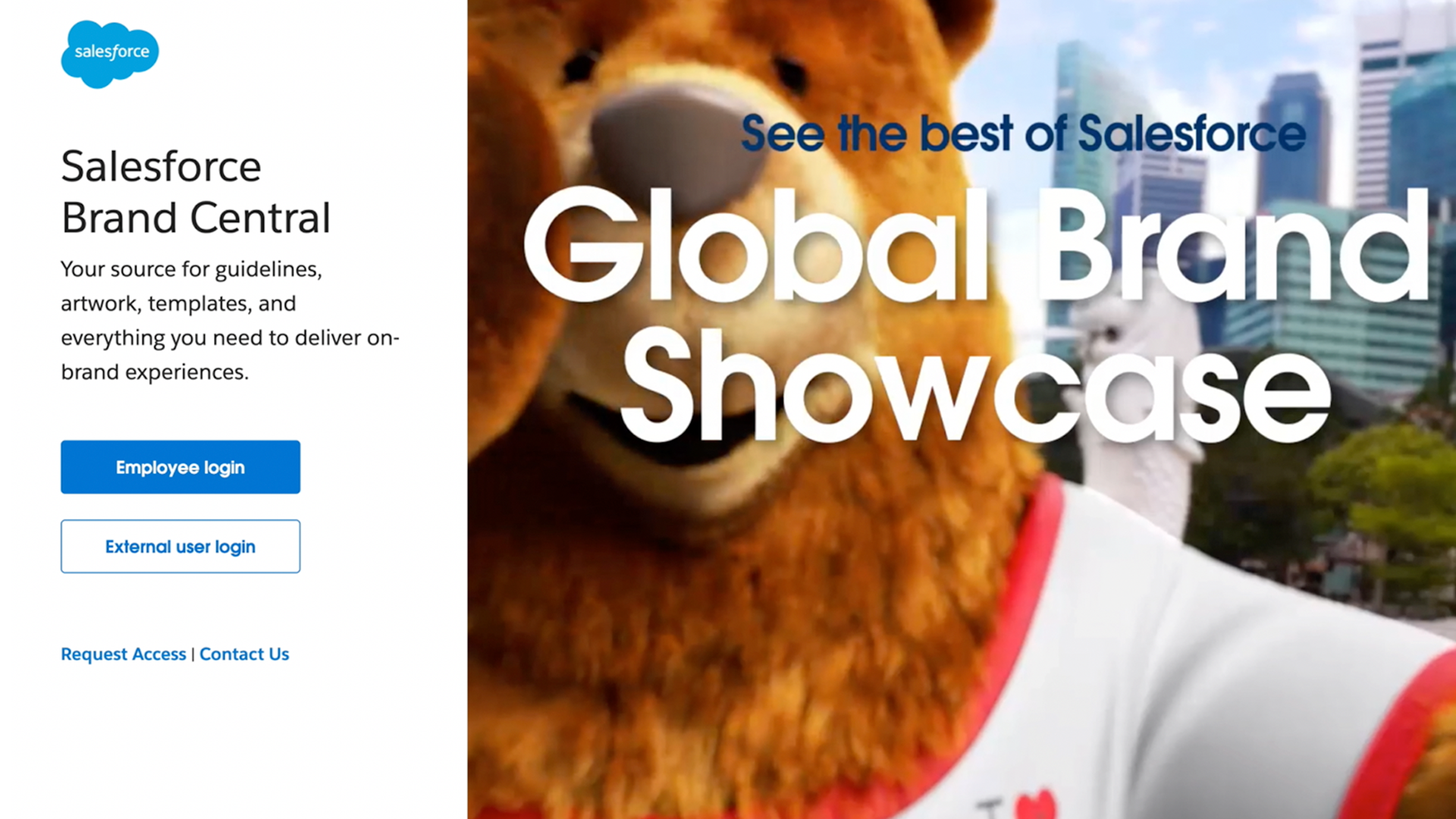


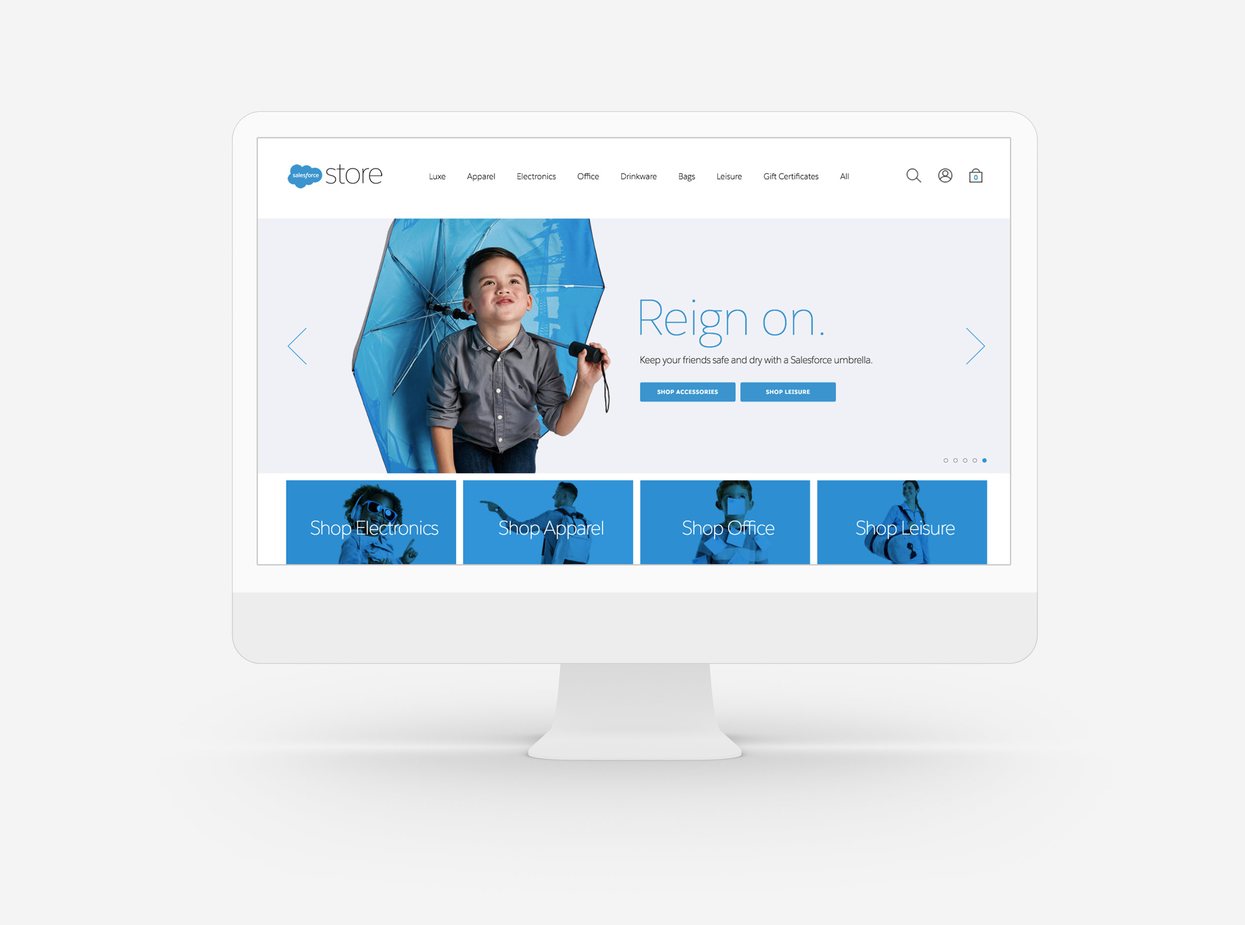

On September 22, 2020 we launched the first brand website for 80,000 employees.
Brand Central serves as our definitive source of information, functioning as a central hub for all things related to the Salesforce brand. It’s filled with all the hows, whys, assets and expertise needed to create marketing that stands out and helps Salesforce remain one of the 50 most recognizable brands on the planet.

(2021)
(This is comp exploration that was never saw the light of day. But I wanted to share.)
Question asked by executives:
“Our logo is blue. Can we make it another color?”
Solution:
Our logo is blue, which makes a lot of sense, since blue is often associated with calm, safety and trust, and is thus a common choice for companies wanting to espouse those qualities.
But we also want to stand out. So as we looked at what is unique to the Salesforce brand, it is our values, our products and our customer- focus, where as the color of our logo color is not.
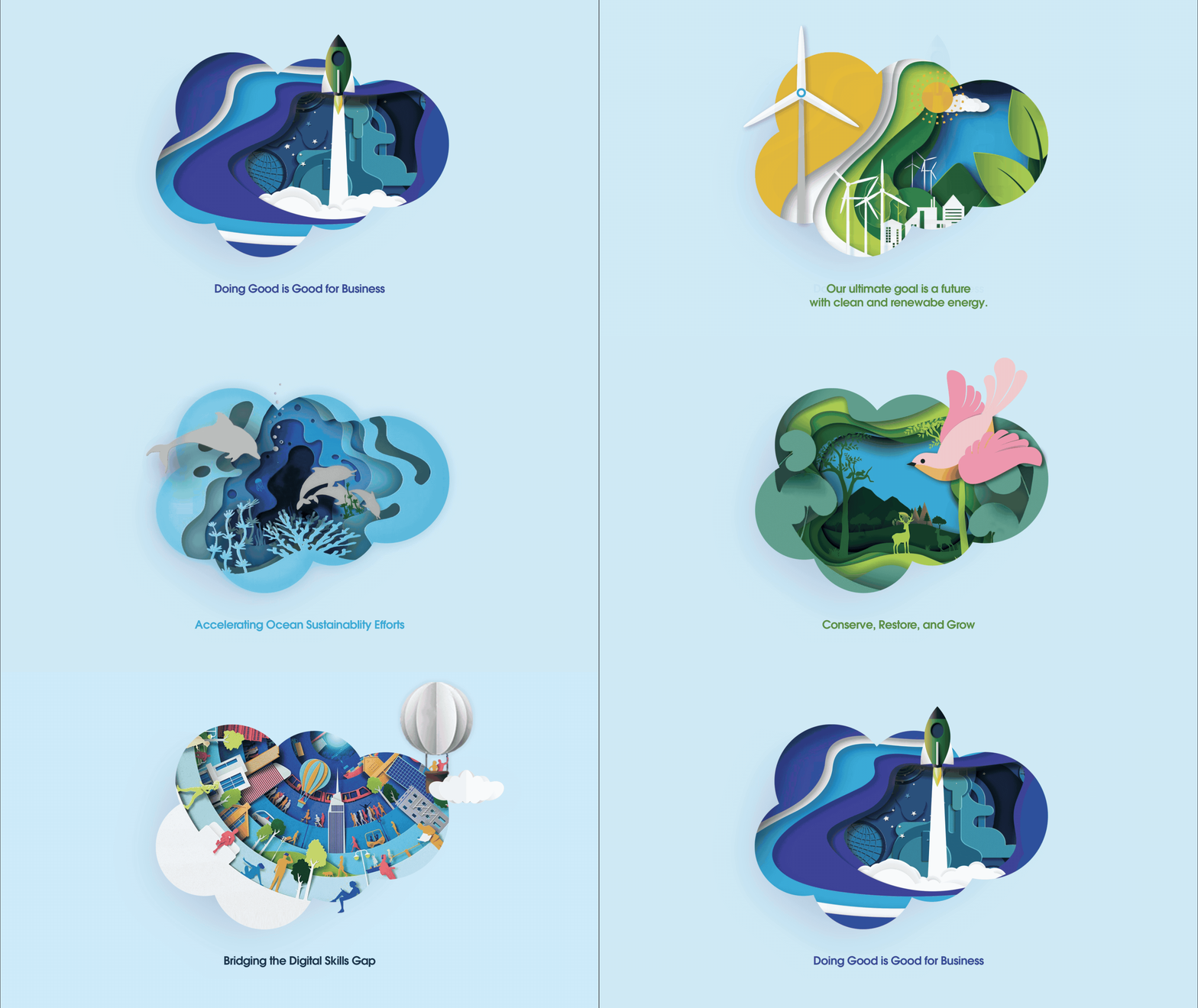
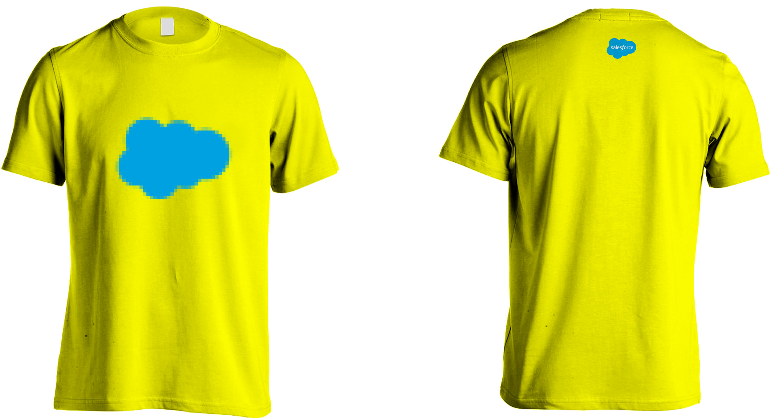
This is not about replacing the Salesforce blue. Instead, we strategically turned the cloud into a creative playground. This idea was called Windows For Change.
Concept write up:
“If there's one thing that we have been saying since time immemorial, it's that 'business is the greatest platform for change'. That a company's profits and purpose can, and should, go hand in hand.
And yet, while our CEO literally wrote the book on this idea, our company's logo in no way reflects it.
But what if it did?
What if our little blue cloud became a window into the change that we espouse? A window into a more sustainable planet, healthier oceans and a more diverse workplace? This direction attempts to make the Salesforce logo synonymous with the future, by using it as a looking glass into the world of tomorrow.”
Our goal was to create an emotional video that would motivate people who may be curious about allyship to take an action. In addition, we would speak to those who are active in allyship, and encourage them through their journey.

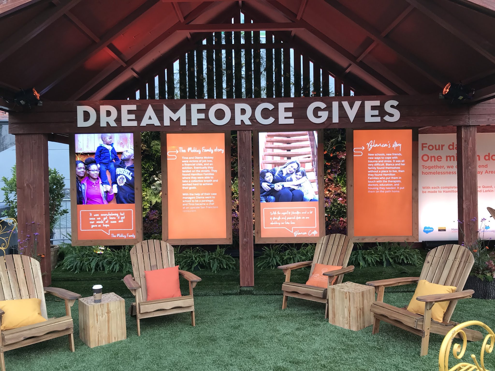
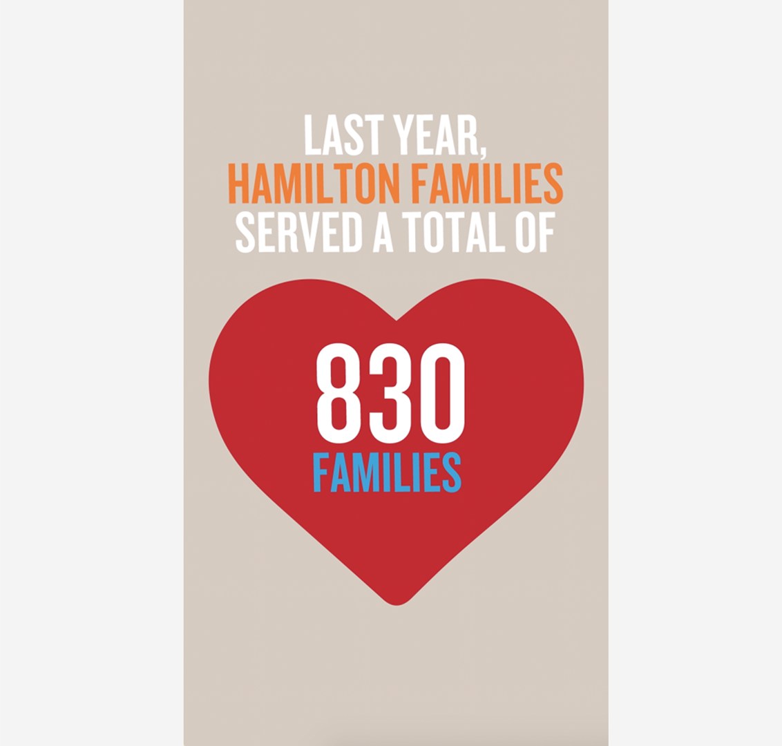
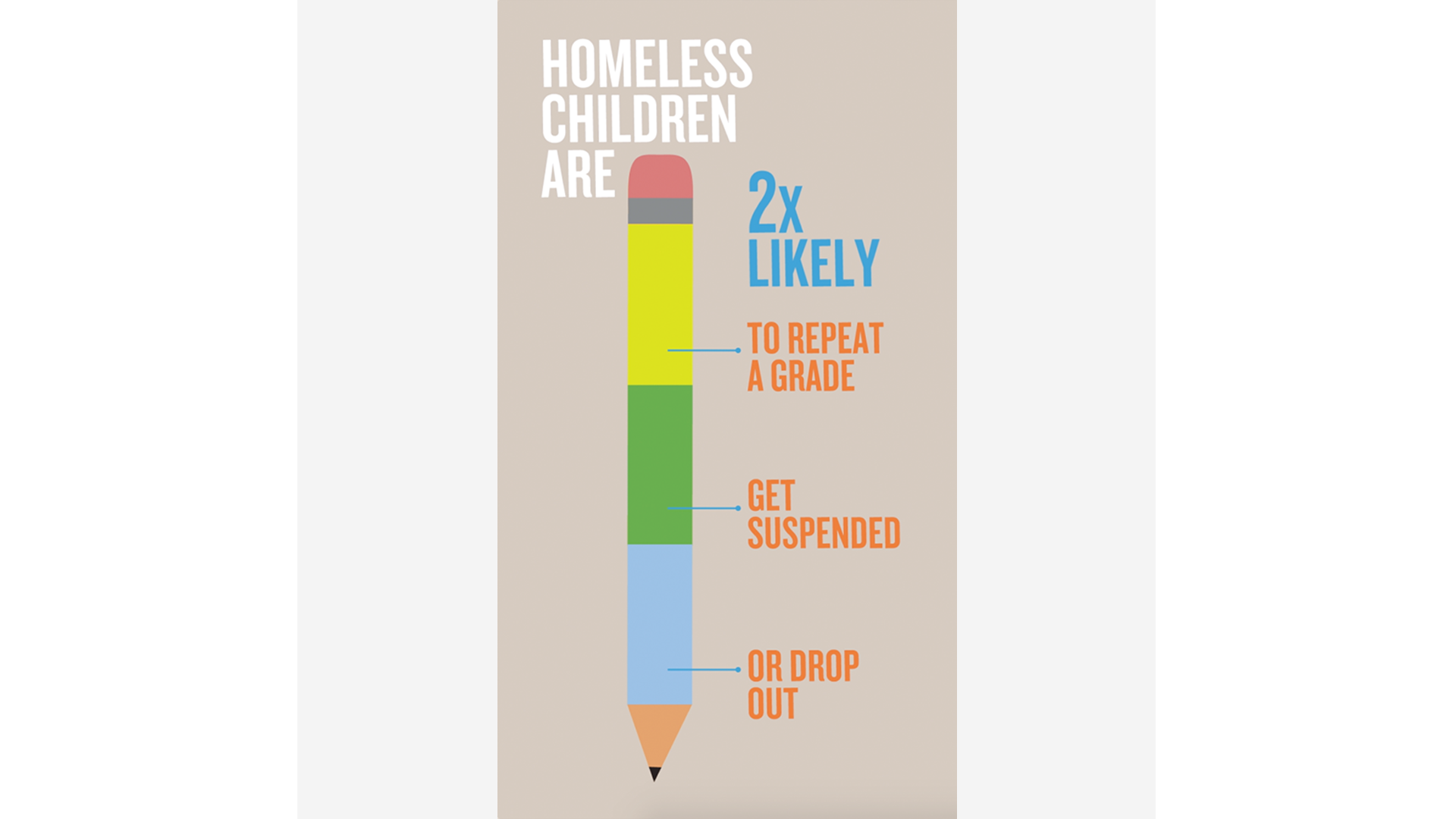
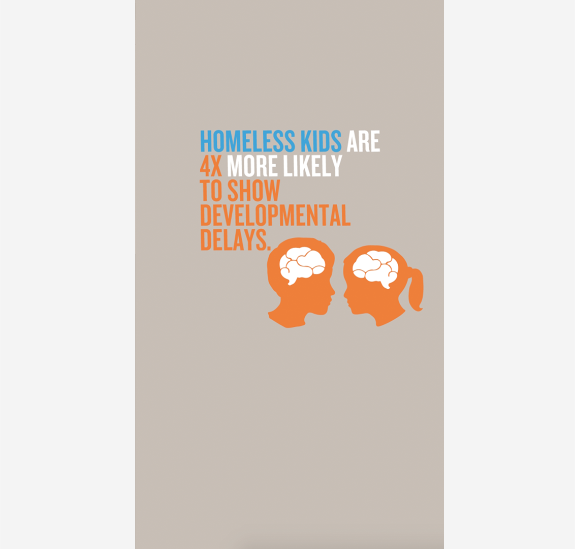
For Dreamforce 2018 Salesforce committed to a $1M grant for Hamilton Families and Larkin Street Youth Services. In addition to giving $1M, Salesforce dedicated a booth called Dreamforce Gives with stories, names, and faces of families and youth struggling with homelessness in our city.
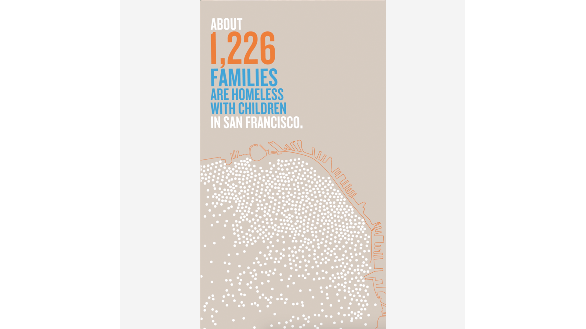
I had to the privilege of designing the stories as well at the infographics. Once I created the storyboards I worked with Bonfire Studios to put each piece in After Effects.
(Please note, I was not responsible for the national park theme design of the booth.)
I did not have much time on the project so my underlying theme was to make the stories and quotes feel as personal as possible.
In this environment people are moving back and forth and resting. The motion of the infographics was designed to capture the glancing eye as well as the resting visitor.

Credits:
Photography: Ronny Knight
Photography Creative Direction: Robert Kastigar
Art Director: Shirleen Lavalais
Writer: Neil Hamilton